
When Your Pinterest Board Has 247 'Perfect' Wedding Color Palettes (And You Still Can't Choose)
It's 11:47 PM and you're sitting on your couch with your laptop burning your thighs, scrolling through the same Pinterest board you've been curating for six months. You have 247 pins saved under "Wedding Colors." Two hundred and forty-seven. And you know what you have decided? Absolutely nothing.
You started with sage green and terracotta because everyone said it was "timeless." Then you saw dusty blue with burgundy and thought maybe that was more you. But wait—what about blush and gold? That's classic, right? Or maybe navy and copper for something different? And don't even get started on whether you need a third accent color or if that's too much or if two colors is too boring or—
Yeah. I've been there. I've watched Sarah cycle through this exact spiral. I've had brides text me at midnight asking if champagne and ivory are "too similar" or if that's actually the whole point. The Pinterest paralysis is so real it should be a medical diagnosis.
Here's what nobody tells you when you're drowning in color palette inspiration: more options doesn't make the decision easier. It makes it impossible. And the wedding industry is really good at giving you infinite beautiful options while providing exactly zero framework for actually choosing between them.
So let's fix that. This isn't another post showing you 47 more gorgeous palette combinations. This is about how to actually make a decision you won't regret, communicate it to vendors who will inevitably interpret "dusty rose" as seven different colors, and maybe—just maybe—give yourself permission to simplify the whole thing.
Here's What We're Getting Into
- The Pinterest Board That Made You Cry
- What Nobody Mentions Until You're Already Committed
- The 2 AM Google Search We Need to Discuss
- Why "Timeless" Advice Is Probably Lying
- How to Choose When You're Stuck
- The Vendor Communication Crisis
- What's Trendy Right Now (And Whether to Care)
- What If You Just Picked Two Colors?
- When the Colors Stop Mattering
The Pinterest Board That Made You Cry
Let me paint you a picture. You're six months out from your wedding. You've got the venue, you've got the date, you've started dress shopping. Everything is progressing. Except you still can't commit to colors.
Every time you think you've decided, you see another stunning wedding on Instagram with a completely different palette and suddenly you're questioning everything. What if sage green looks dated in five years? What if blush pink is too basic? What if navy is too dark for a spring wedding? What if you're making a mistake?
😰 Sarah's Color Board Spiral
Sarah—my best friend, perpetual source of wedding chaos—spent three months building the perfect Pinterest board. She had it organized into sections: "Primary Colors," "Accent Colors," "Seasonal Alternatives," "Backup Options." It was color-coded. She made spreadsheets comparing hex codes.
One night she called me at almost midnight, actually crying. Not like cute sniffles—full crying. She'd been looking at her boards for two hours and she said every single palette now looked wrong to her. They all looked either too trendy or too boring or too complicated or too simple. She couldn't see them clearly anymore.
I drove over with wine. We closed the laptop. We didn't talk about colors for three days.
That's when I realized the Pinterest problem: unlimited inspiration is actually a form of torture.
Here's what's happening when you hit this wall. Your brain is trying to make a creative decision with no constraints. And human brains are actually terrible at that. We need boundaries. We need limits. We need something to push against.
The wedding color industrial complex has figured out that keeping you in inspiration mode—always showing you one more beautiful option—keeps you clicking. Keeps you pinning. Keeps you coming back. But it doesn't help you decide.
The Real Problem: You don't need more color palette inspiration. You need a decision-making framework that works with how your brain actually functions under pressure.
And before we get to that framework, we need to talk about all the stuff that constrains your choices that nobody mentions until you're already emotionally attached to a palette that won't actually work.
The Stuff Nobody Mentions Until You've Already Fallen in Love With a Palette
Okay, real talk time. Your color choices aren't happening in a vacuum. There are actual, physical constraints that will limit your options, and most inspiration content conveniently forgets to mention these until you're already planning your sage-and-terracotta dream wedding.
Let's start with the big one: your venue has colors you cannot change.
🤦♀️ The Burgundy Carpet Revelation
I was helping my cousin Maria with her venue walkthrough. She'd fallen completely in love with a soft pink and sage palette—delicate, romantic, very spring garden vibes. The venue photos online showed these gorgeous neutral spaces.
We walk in for the tour and the ceremony space has burgundy carpet. Deep, wine-colored, very-much-permanently-installed burgundy carpet. The kind that photographs darker than it looks in person. The reception space? Burgundy chair cushions that were part of the package.
Maria's pink-and-sage palette would have looked like Christmas threw up on Valentine's Day. We had to completely rethink her colors on the spot.
Venue constraints are real. You've got existing carpet, wall colors, draping, chairs, table linens that might be included. Some venues have lighting that's warm-toned or cool-toned and will shift how your colors photograph. That perfect dusty blue might look purple under tungsten uplighting.
📋 What to Check: At your venue walkthrough, photograph the space with your phone at the time of day your wedding will happen. Look at those photos, not the professional venue shots. That's what your colors have to work with.
Then there's seasonal flower availability. And I'm not talking about the soft "guidelines" from flower blogs. I'm talking about actual supply chain reality.
Peonies in October? Not happening locally, and if your florist can source them, you're paying premium import prices. Deep burgundy dahlias in April? Those are fall flowers. You can force things out of season, but your budget will feel it.
Some colors are genuinely more expensive to execute. Metallics cost more in linens. Certain dye colors cost more in bridesmaid dresses. If you want all-white flowers—the supposed "simple" option—you're often paying more than mixed seasonal colors because availability matters.
💰 Cost Reality Check: Before you fall in love with an all-white rose and hydrangea palette, get actual quotes. "Simple" often costs more than you'd think.
And then there's lighting. Natural light, uplighting, string lights, candles—they all change how colors look in person and in photos. I've seen a beautiful soft lavender turn almost gray in photos because the venue's natural light was too cool-toned. I've seen blush pink look orange under warm uplighting.
What This Means: Your color decision isn't just aesthetic. It's logistical. And the sooner you factor in your actual constraints, the easier this gets.
Constraints aren't the enemy. They're actually your friend. They eliminate options. They make the decision smaller.
But even after you factor in constraints and make a choice, there's this nagging fear that doesn't go away. The fear that you picked wrong. That you're going to look back at your wedding photos in five years and cringe. That feeling has a name, and we need to talk about it.
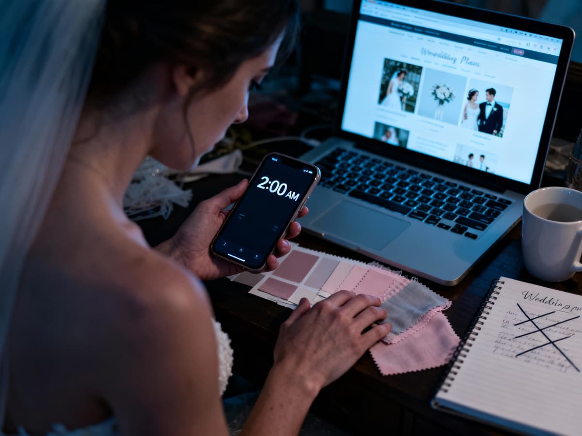
Can We Talk About Color Regret? (Because You're Not the Only One Googling This at 2 AM)
Color regret. It's the thing brides whisper about on Reddit at 2 AM but won't admit in their Facebook planning groups. That feeling—three months after you've picked your palette, ordered the bridesmaid dresses, sent the color specs to your florist—that maybe you made the wrong choice.
Maybe you should have gone with the dusty blue instead of the sage. Maybe the burgundy was too dark. Maybe you should have stuck with classic blush and gold instead of trying to be different. Maybe everyone's going to look at your photos and think your colors were ugly.
😱 The 2 AM Text Message
Sarah texted me at 2:17 AM—I remember because it woke me up and I checked. Just: "I think I picked the wrong colors."
This was four months before her wedding. She'd already ordered bridesmaid dresses in dusty blue. Already confirmed the palette with her florist. Already designed invitations with the color scheme.
She'd been scrolling Instagram and saw a wedding with a sage green palette. It looked so fresh, so modern. Suddenly her dusty blue felt dated, heavy, wrong. She was convinced everyone would judge her. Convinced she'd hate her own wedding photos.
I talked her down. Reminded her why she picked dusty blue in the first place—it matched her venue's blue-gray walls, it photographed beautifully in natural light, it was her favorite color. But that panic was real.
Here's what I learned from watching this happen—not just with Sarah but with probably a dozen brides I've worked with. Color regret is almost never about the colors. It's about decision fatigue, comparison anxiety, and the brain's tendency to second-guess big choices once they're final.
There's actual psychological research on this. When we make decisions with lots of options, we're more likely to experience "post-decision regret" even when we made a perfectly good choice. It's not that the choice was wrong. It's that our brain keeps wondering about the paths not taken.
The Truth About Color Regret: It's usually not about the colors being bad. It's about the stress of committing to something permanent in an age of infinite options.
So how do you prevent it? Or at least reduce the chances of waking up at 2 AM questioning everything?
💡 Prevention Strategy #1: Stop consuming color palette inspiration once you've decided. Seriously. Unfollow the wedding hashtags. Stop clicking color palette posts. Every new beautiful option you see will make you doubt your choice.
💡 Prevention Strategy #2: Save your "why I chose this" reasoning. Write it down. When you pick your palette, actually document why—it matches your venue, it feels like you, it's your favorite color, whatever. When regret creeps in, you have something to anchor to.
💡 Prevention Strategy #3: Give yourself a "final decision" deadline, then honor it. Two weeks after you choose, that's it. Done. No more deliberation. This sounds arbitrary but it works—your brain needs permission to stop deciding.
And look, I'm gonna level with you. Some people do change their colors. I've seen it happen. Usually it's early enough that nothing's been ordered yet, or they're willing to eat the cost of re-doing bridesmaid dresses. It's messy but survivable.
But most people? They get to the wedding day and realize the colors they stressed about for months are just... there. Pretty. Doing their job. The color regret that felt so huge at 2 AM feels ridiculous in hindsight.
Which brings me to something that's going to make some people mad. This whole "timeless colors" thing everyone keeps telling you? It's kind of a scam.
The 'Timeless' Wedding Colors That Are Already Looking Dated
Every wedding color article tells you to "choose timeless colors." Pick classics. Don't follow trends. Go with neutrals that will "never go out of style."
And then they show you sage green with terracotta. Dusty blue with burgundy. Champagne with gold. The exact palettes that have been everywhere for the last three years.
Here's what nobody wants to admit: those "timeless" palettes are just current trends wearing a disguise. They're trendy neutrals. And they're already starting to look dated.
🔥 The Sage Green Saturation Point
I went to four weddings in one summer. Four. All of them had sage green in the palette. Sage green bridesmaid dresses. Sage green table runners. Sage green in the florals. Sage green in the invitations.
The first one looked fresh and modern. By the fourth one, I was having déjà vu. And when I went back and looked at photos, they all kind of blurred together. Same aesthetic. Same Pinterest vibe. Same "timeless neutral" energy that was actually just "what everyone's doing right now."
One of those brides—I'm not naming names—texted me a couple years later. She'd just looked at her wedding photos and felt weird about how much they looked like everyone else's from that year. The colors weren't bad. They just felt very much of that moment.
So let's talk about what actually makes something timeless versus trendy. Because there is a difference, and it's not what the blogs are telling you.
Trendy disguised as timeless: Dusty/muted versions of colors that are currently saturating Instagram. Right now that's sage green, terracotta, dusty blue, mauve. These feel modern because everyone's using them. In five years they'll feel very "early 2020s" the same way teal and orange screams "2012."
Actually timeless: Colors that have been used consistently across multiple decades. Navy. Burgundy. True blush pink. Gold. Ivory. Forest green. These aren't exciting, which is why blogs don't feature them as much. But they actually don't date themselves.
The Real Test: If you can identify the era of a wedding by its color palette alone, it's not timeless. It's a trend from that era.
And look, I'm not saying don't pick trendy colors. If you genuinely love sage green and terracotta, use them. Your wedding photos will capture a specific moment in time, and that's okay. Maybe that's even good—a time capsule of what felt beautiful in this moment.
Just don't do it because someone told you it was "timeless" when it's actually "trendy right now." Be honest about what you're choosing.
⚠️ Trend Check: If a color palette is being called "timeless" but you've seen it at multiple weddings in the last year, it's trending. That doesn't make it wrong—just don't fool yourself about what it is.
The thing is, most people don't actually want "timeless." They want colors they love that won't embarrass them later. And those aren't the same thing.
What you actually need is a way to choose colors that feel authentic to you, work with your constraints, and don't send you into decision paralysis for six months. So let's get practical.
How to Actually Choose When You're Stuck Between Three 'Perfect' Palettes
Alright. You've narrowed it down. You're not at 247 Pinterest pins anymore—you're at two or three finalist palettes that all seem equally good. And you've been stuck here for weeks.
This is where most color palette advice fails you. They give you more inspiration. More options. More beautiful photos. What you actually need is a way to just pick and move forward.
Here's the framework I walk people through when they're genuinely stuck and need to make a decision.
Test #1: The Venue Reality Check
Pull up photos of your actual venue—not the styled professional shots, the real photos you took on your phone during your walkthrough. Now picture each palette in that space. With that carpet. With those walls. With that lighting.
One of your finalist palettes is going to clash. Or require too much work to override the venue's existing aesthetic. Or just not fit the vibe of the space. That's the one you eliminate.
📸 Action Step: If you don't have venue photos, go take some right now. During the time of day your wedding will be. With your phone, not a fancy camera. That's your reality.
Test #2: The Photo Longevity Question
This one feels hard but it's actually pretty simple. For each remaining palette, imagine looking at your wedding photos in 20 years. Not five years—20.
Which palette are you going to want to see? Which one captures who you are right now in a way that will still feel authentic to older-you? Which one is going to make you smile because it's so perfectly you?
You're not trying to predict trends. You're trying to identify what feels like you versus what feels like something you're trying on because it's pretty.
Test #3: The Daily Life Test
Look around your actual home. Your closet. Your daily life. What colors do you naturally gravitate toward? Are your walls painted neutrals or colors? Do you wear a lot of black and white, or are you a color person?
Your wedding palette should feel like an extension of your actual aesthetic, not a departure from it. If you live in a world of minimalist neutrals, a boho jewel-tone palette is going to feel like cosplay.
The Hard Truth: If a palette doesn't feel like "you" in your regular life, it's probably not going to feel authentic at your wedding. Even if it's gorgeous on Pinterest.
Test #4: The Vendor Communication Test
This one's practical. Which palette is going to be easiest to communicate and execute? Sage green and terracotta—vendors know what you mean right now because everyone's doing it. Dusty blue and burgundy—clear, distinct colors. Easy.
But "champagne and ivory" or "blush and dusty rose"? Get ready for miscommunication. Multiple shades that look different in photos. Endless back-and-forth. These aren't bad palettes—they're just harder to execute.
If you're already stressed about vendor communication, pick the palette with the clearest, most distinct colors. Your future self will thank you.
💬 Sanity Check: Can you describe each color in your palette in one clear word? If you need phrases like "dusty blush with mauve undertones," you're signing up for communication hell.
Okay. You've run the tests. You've thought about venue reality, photo longevity, your actual aesthetic, and vendor ease. One palette should be pulling ahead.
If you're still genuinely stuck? Flip a coin. I'm serious. If you flip a coin and feel disappointed by the result, pick the other one. If you feel relieved, that's your answer.
Your gut knows. You just need permission to listen to it and stop deliberating.
But once you've chosen, you've got a whole new problem: making sure every vendor interprets your colors the same way. And oh man, do I have stories about this.
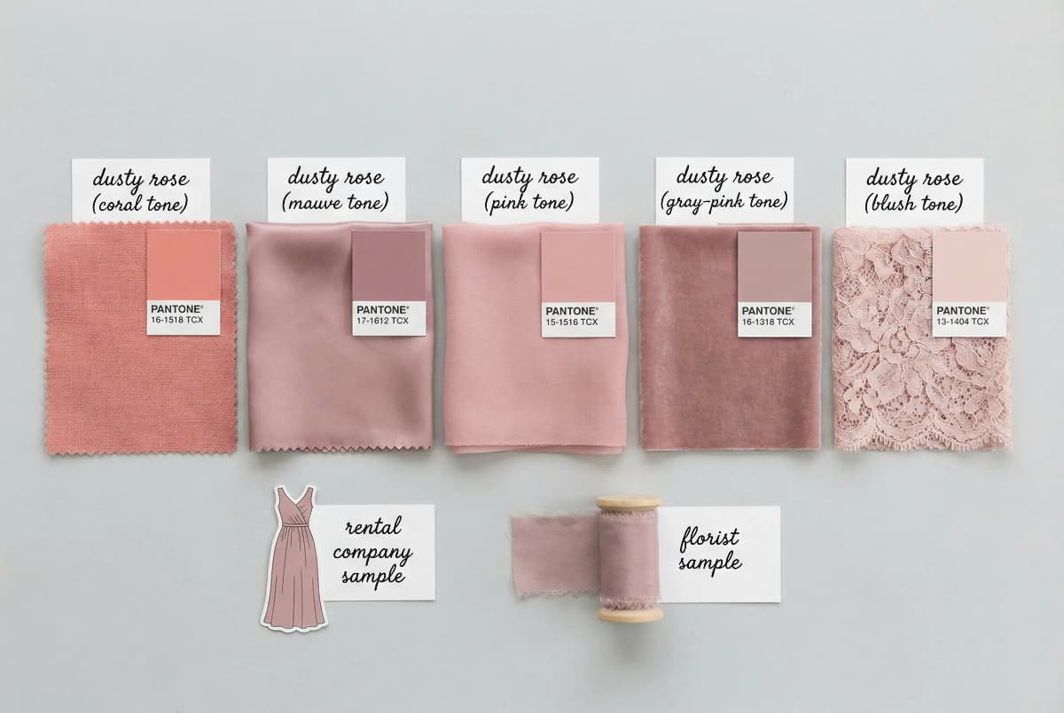
Why Your 'Dusty Rose' Looks Like Salmon (And How to Fix It Before the Wedding)
You picked your palette. You're feeling good. You tell your florist "dusty rose and sage green." You tell your rental company "dusty rose linens." You tell your bridesmaids "dusty rose dresses."
Wedding day arrives. The flowers are coral. The linens are mauve. The dresses are pink. None of them match. Everyone interpreted "dusty rose" differently and now your carefully coordinated palette looks like three separate events happened in the same room.
This is the color communication crisis nobody warns you about.
😱 The Five Shades of Dusty Rose
I was at a wedding where the bride's vision was this beautiful dusty rose and eucalyptus palette. Soft, romantic, cohesive. She'd pinned examples. She'd sent inspiration photos to all her vendors.
The bridesmaid dresses arrived first—these were a true dusty rose, muted pink with gray undertones. Perfect. Then the flowers came the morning of—these were more coral-pink, much warmer. Then the linens—these were mauve, definitely purple-toned.
Nothing was terrible on its own. But together? It looked confused. Like someone had grabbed three different wedding palettes and mashed them together. The photos were... not cohesive.
The bride was gracious about it, but I saw her face when she walked in. That wasn't what she'd been picturing for eight months.
Here's the thing: color names are useless. Completely useless. "Dusty rose" means something different to every person, every vendor, every fabric company. "Sage green" could be gray-green or blue-green or yellow-green depending who you ask.
So how do you prevent this?
💡 Strategy #1: Physical Swatches
Get an actual fabric swatch from your bridesmaid dress company. This is your anchor color. Carry this swatch to every vendor meeting. Say "I need this exact shade." Let them take photos of it. Let them hold it up to their sample books.
Physical swatches don't lie. Photos can look different on every screen. But a piece of fabric is what it is.
💡 Strategy #2: Hex Codes and Pantone Numbers
For every color in your palette, find the hex code or Pantone number. This is the technical specification—a universal language for color. Most florists and rental companies can match to Pantone numbers.
Yes, this feels extra. Do it anyway. "Pantone 16-1511" is a lot more specific than "dusty rose."
💡 Strategy #3: Request Samples Before the Wedding
For anything you can't see in person beforehand—linens, flowers, stationery—ask for samples or mockups. A linen company can send a 6-inch swatch. A florist can make a small sample arrangement. Stationery comes with proofs.
Don't wait until wedding day to find out if everyone's on the same page.
And here's the question everyone asks: How many colors should you even have?
The actual answer: Two to four colors is the sweet spot. One or two main colors, one or two accents. More than that and you risk things looking chaotic. Less than that and you might look too matchy-matchy unless you're really intentional about it.
The Color Count Truth: Three colors is usually plenty. One main color, one secondary, one accent. Any more and you're increasing coordination difficulty for minimal visual payoff.
The other question: Should your colors match the season?
Honestly? It helps. Spring pastels look natural in spring light. Jewel tones photograph gorgeously in fall. But it's not a hard rule—I've seen summer weddings with moody burgundy and navy that worked because the couple committed fully to the vibe.
The season thing is more about practical ease than aesthetic rules. Spring flowers are pastel. Fall flowers are deeper. You can force it the other way, but your budget will notice.
Which brings us to trends. Because you're probably wondering: what's actually trending right now, and should you care?
The 2025 Color Palette Trends (And Why You Can Ignore Them If You Want)
Let's just say it straight: Here's what's trending in wedding colors right now, early 2025.
Sage green with terracotta is fading. It's still around but it's past peak saturation. Dusty blue with burgundy had its moment and is settling into "classic" territory. What's rising: warmer neutrals—think caramel, burnt orange, warm terracotta but deeper than before. We're also seeing a return to true jewel tones—emerald, sapphire, deep plum—especially for fall and winter weddings.
Sage green is being replaced by deeper eucalyptus and olive tones. The muted pastels are giving way to slightly more saturated colors. Champagne and gold are evergreen but getting paired with unexpected colors—navy, burgundy, even black for formal weddings.
And you know what's causing this shift? Instagram. TikTok. The speed at which we consume and get tired of visual aesthetics has accelerated. A color palette can feel fresh for maybe 18 months now before it starts to feel "overdone."
The Trend Cycle Reality: Wedding color trends now move as fast as fashion trends. What feels current today might feel dated in two years. That's just how it works now.
So should you care? Should you pick trendy colors or avoid them?
Here's my actual take: Do whatever you want.
If you genuinely love sage green and terracotta, use them. Who cares if they were trendy? They're pretty. They work. Your wedding is one day, and if those colors make you happy, they're the right choice.
If you're drawn to current trends—the warm neutrals, the deeper jewel tones—go for it. Trends exist because a lot of people find them beautiful right now. That's not a bad reason to choose them.
The only time trends are a problem is when you're picking them because you think you're supposed to. When you don't actually love them but you're choosing them because they're "what everyone's doing." That's when you end up with color regret.
🎯 The Gut Check: If someone told you that your chosen palette was "so 2024," would you care? If the answer is no—you love it anyway—then it's the right choice. If the answer is "oh god, is it?"—keep thinking.
The other thing about trends: sometimes they're actually useful. If you're stuck in decision paralysis, trends can give you a starting point. They're popular for a reason—they tend to photograph well, vendors know how to execute them, and there are lots of examples to pull from.
Ignore the people who say "don't follow trends" while simultaneously only showing you trendy palettes. Make your choice based on what you actually want, not what you think you should want.
And if what you actually want is to stop overthinking this entire thing? I have good news for you.
What If You Just Picked Two Colors and Stopped Overthinking?
I'm going to say something that might feel radical: You don't need a complex color palette. You don't need three accent colors and metallic details and ombré effects. You can pick two colors and call it done.
The wedding industry has convinced you that a sophisticated aesthetic requires complexity. Multiple shades. Layers. An elaborate color story. And yeah, that can be beautiful. But it's not required.
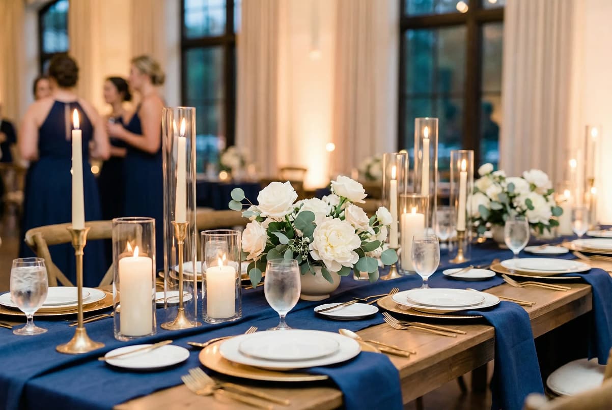
💕 The Two-Color Wedding That Worked
I went to a wedding that was just navy and gold. That's it. Navy suits for the groom and groomsmen. Navy bridesmaid dresses. Gold accents in the florals and table settings. White flowers because the bride wanted them, but the palette was just those two colors.
It was one of the most cohesive, elegant weddings I've been to. Nothing looked confused or chaotic. Every photo looked intentional. The simplicity made everything feel more sophisticated, not less.
The bride told me later she almost added blush pink as a third color "to soften it" but her florist talked her out of it. She's so glad she kept it simple. The photos are timeless.
Compare that to a wedding I attended where the palette was dusty blue, burgundy, blush, gold, and sage green. Five colors. It looked... busy. A little confused. Like they couldn't decide so they just used everything. And it made vendor coordination way harder than it needed to be.
Sometimes simple is the answer. Two colors—one main, one accent. Or even just variations of one color family. Ivory, champagne, and gold. Different shades of blue. Multiple pinks. You don't need variety across the color wheel to have visual interest.
Permission to Simplify: If the color palette is stressing you out, you can just pick your two favorite colors and be done. Navy and blush. Burgundy and gold. Sage and ivory. That's a complete palette.
The Instagram aesthetic pressure makes everyone think they need this elaborate, layered color story. Multiple shades of each color. Accent colors. Metallic details. Ombré bridesmaid dresses. Gradient florals.
But that's not mandatory. That's one option. Simple and intentional is also an option.
✅ The Simplification Test: If you remove one color from your palette, does everything still work? If yes—you might not need that color. Keep simplifying until removing one more thing would actually hurt the aesthetic.
And here's what nobody tells you: On your actual wedding day, the color palette matters way less than you think it does right now.
The Moment You Realize the Colors Were Never the Point
It's halfway through your reception. You're sitting at your sweetheart table, catching your breath between conversations, and you look up. Really look up. At the room, the people, the whole thing.
The colors you agonized over for six months? They're there. They're pretty. They're doing exactly what they're supposed to do—creating a backdrop. But what you're actually noticing is your grandmother laughing at your uncle's toast. The way the light catches your partner's face when they look at you. The sound of all your favorite people in one room together.
You can barely remember if you chose the dusty rose or the dusty blue. Was there a third accent color? Doesn't matter. It all looks nice. It all works.
💫 Sarah's Reception Realization
Sarah—who cried over her Pinterest board, who couldn't decide for three months, who texted me at 2 AM in a panic—told me something at her reception that I think about all the time.
We were standing by the bar, watching everyone dance. She looked around at the dusty blue she'd been so worried about and said, "I spent so much time stressing about this. And now I'm here and I can't remember why I thought it mattered so much."
The colors were beautiful. They photographed well. They looked cohesive. But that's not what she was going to remember. She was going to remember her dad crying during his speech. Her husband's face when she walked down the aisle. Her college friends doing a terrible coordinated dance to a song from sophomore year.
The dusty blue was just the background of those moments. Pretty background. But background.
This isn't me saying colors don't matter. They do matter—they set the aesthetic, they show up in every photo, they're part of your wedding's visual story. The decision is worth making thoughtfully.
But they're not worth the level of anxiety a lot of us bring to them. They're not worth 2 AM panic spirals or months of paralysis or genuine fear that you'll regret your choice forever.
Pick colors you love. Make sure they work with your venue. Communicate them clearly to your vendors. Then trust that decision and move on. Because there are about 47 other wedding decisions waiting for you, and most of them matter more than whether you picked sage or eucalyptus.
What You'll Actually Remember: Not whether the dusty rose was too pink. You'll remember who was there, what they said, how it felt. The colors are just the frame around that picture.
The Pinterest board with 247 pins? It was never really about finding the perfect palette. It was about trying to control something in a process that feels overwhelming and high-stakes. And I get that. But you can let go now.
Pick the colors that make you happy when you think about them. The ones that feel like you. The ones that work with your actual, logistical reality. Then close the Pinterest board and go plan the parts of your wedding that you'll actually remember.
The colors will be fine. Better than fine. And on your wedding day, surrounded by everyone you love, you're going to look around and think "this is exactly right"—not because the palette was perfect, but because the day is.
Trust me on this one. Or if you can't trust me, trust future-you on your wedding day, looking around and realizing none of the stuff you stressed about really mattered after all.